
Since the Bulls are back, time to look at how they are doing. On the season, the Bulls are 23-19, four games above .500. Although the Bulls have had a bad stretch, as you can see, our opponents in the South Division have been waiting for us. Five teams in the International League have better records than the Bulls now, they just aren’t in the South.

Run production and run differential is way down over the last several games, enough to start pushing the trend in an ugly direction. Some of that might be that we had a terrific run and now are seeing some falling off. This next home series against Pawtucket and Rochester should give us some clues about the future.

This shows the cumulative
Weighted On Base Average (wOBA) of the Bulls in green and the cumulative wOBA of their opponents in red for the last 20 games. As expected, as the season goes along, these curves start to flatten out (the Bulls have had some 1644 plate appearances so far this year). If this chart is to be useful, the trick will be to tease out trends and point out what changes, if any, seem to be occurring. This chart sure seems to show that the problem over the last several games has not been our defense/pitching (the red line), but rather our offense. That is, we aren’t getting many extra base hits. Another way of saying that is that the problem has been more our lack of run production, not keeping our opponents from scoring.

Lastly, just for grins, here are the wOBA plots for the last 20 games for the Rays. What jumps out is the difference in the Opponents wOBA numbers. That is, the Rays pitching and defense is really good. The hitting? Could be better.
 Since the Bulls are back, time to look at how they are doing. On the season, the Bulls are 23-19, four games above .500. Although the Bulls have had a bad stretch, as you can see, our opponents in the South Division have been waiting for us. Five teams in the International League have better records than the Bulls now, they just aren’t in the South.
 Run production and run differential is way down over the last several games, enough to start pushing the trend in an ugly direction. Some of that might be that we had a terrific run and now are seeing some falling off. This next home series against Pawtucket and Rochester should give us some clues about the future.
 This shows the cumulative Weighted On Base Average (wOBA) of the Bulls in green and the cumulative wOBA of their opponents in red for the last 20 games. As expected, as the season goes along, these curves start to flatten out (the Bulls have had some 1644 plate appearances so far this year). If this chart is to be useful, the trick will be to tease out trends and point out what changes, if any, seem to be occurring. This chart sure seems to show that the problem over the last several games has not been our defense/pitching (the red line), but rather our offense. That is, we aren’t getting many extra base hits. Another way of saying that is that the problem has been more our lack of run production, not keeping our opponents from scoring.
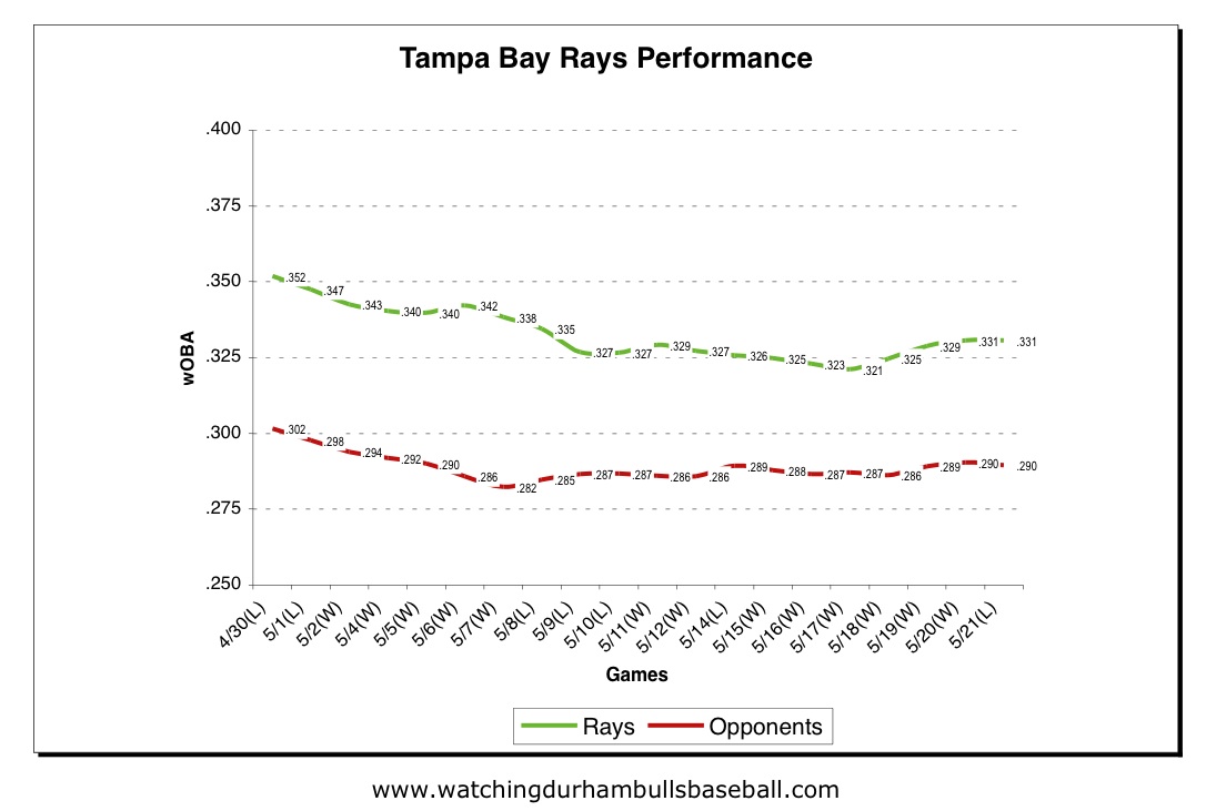 Lastly, just for grins, here are the wOBA plots for the last 20 games for the Rays. What jumps out is the difference in the Opponents wOBA numbers. That is, the Rays pitching and defense is really good. The hitting? Could be better.


Chris - Did you see that there's a link to these charts on the Durham Bulls homepage under "Headlines"? Way to go!
ReplyDeleteDonna -- I had not seen it until you let me know. Cool! Thanks.
ReplyDelete